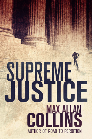
Over the last two weeks, Matt Clemens and I have been going over potential covers for the upcoming SUPREME JUSTICE, coming out June 1.
Thomas & Mercer, Amazon Publishing’s mystery/suspense line, has been very good about making me – and Matt, because he contributed so mightily to both novels – part of the book cover process for both WHAT DOESN’T KILL HER and SUPREME JUSTICE. This is hardly common in publishing – in fact, it’s the opposite of common.
What often happens is that I’m asked for my opinion – in the context of how important that opinion might be, given my background in visual arts like comics and film – but rarely has my input been given much if any consideration.
That’s been improving in recent years. Our editor at Kensington always asks Barb and me for ideas for the covers of the ANTIQUES books, and those ideas have been used for the most part.
Titan is careful to run covers past me, and I had considerable input on the Mike Hammer mass market editions, where initially the depiction of Hammer was wrong. The publisher of Titan himself, Nick Landau, enthusiastically presented the hardcover Hammer dust-jacket art over drinks at San Diego Con a few years ago.
At Hard Case Crime, Charles Ardai often discusses what artists might be available for my next book – obviously the first thing out of my mouth is, “How about McGinnis?” But I essentially chose the cover artists for THE WRONG QUARRY (Tyler Jacobsen) out of three or four Charles showed me examples by. And THE WRONG QUARRY seems to be universally regarded as one of (if not the) strongest of my Hard Case covers.
As I may have mentioned here before, those covers are usually done before I’ve written the novel, with just a paragraph precise of the unwritten book for the artist to go by. That means I often have to work to get the cover image into the book.
On the other hand, I provided Forge with lots of input into BYE BYE, BABY’s hardcover jacket that was eventually ignored, due to worries that the Monroe estate would sue. I hate that cover (though the mass market paperback is much better). Where both TARGET LANCER and ASK NOT were concerned, however, I was given the opportunity to give my two cents, and was listened to. Often I write the cover copy, even the front “reading lines” (blurbs), when what is submitted to me seems weak.
So it has improved a lot. I’ve come a long way from when I received BAIT MONEY and BLOOD MONEY in the mail in December 1972 and found fairly terrible photo covers and my name changed from Allan Collins to Max Collins, and my character Nolan given an unwanted first name (“Frank”) which to this day dogs both Nolan and me. Then there’s the day I opened a package and saw that my novel QUARRY and its sequel HIT LIST were now THE BROKER and THE BROKER’S WIFE, the latter title a spoiler for a major plot turn…again, with photo covers, though slightly better ones.
But now Thomas & Mercer has given me a chance not only to suggest cover images, but provides me with half a dozen to choose from, and does tweaks on the art that I’ve suggested. I wish I could include the SUPREME JUSTICE rejects here, because they were strong, too. But I don’t know the legality of that.
Maybe next time I do a book for them, I can put the proposed covers up here and seek your input.
For now, I am delighted with the cover for SUPREME JUSTICE.
Brief movie report.
We liked MR. PEABODY AND SHERMAN, me more than Barb. It captured the Jay Ward cartoons well and was very smart in its storytelling – a little long, though. See it in 3-D.
NON-STOP was a good thriller, somewhat stupid in the motivation of the villains, but a ride worth taking.
300: RISE OF AN EMPIRE is better than the original, and is a rousing battle picture with an eye-popping sex scene (see that in 3-D, too). But it’s fairly numbing in its more-and-more-of-the-same gory action, and at heart is a very brain-dead right-wing screed. Still, I dug it. I am, as should be evident by now, a sucker for anything in 3-D that doesn’t outright suck.
Speaking of sucking, we walked out of DIVERGENT about half an hour in. I’d read some promising reviews, but this is a really poorly thought-out imitation of HUNGER GAMES (which is a poorly thought-out imitation of BATTLE ROYALE). Really, really dumb, and also dreary and dull. We bailed when some recruits in the Dauntless faction (don’t ask) said, “Let’s do something fun! Let’s get tattoos!”
Let’s wind up this update with a link to a very nice WRONG QUARRY review from Blog Critics.
Tags: Bye Bye Baby, Covers, Nathan Heller, Quarry, Reviews, Supreme Justice, The Wrong Quarry, Trash 'n' Treasures, What Doesn't Kill Her